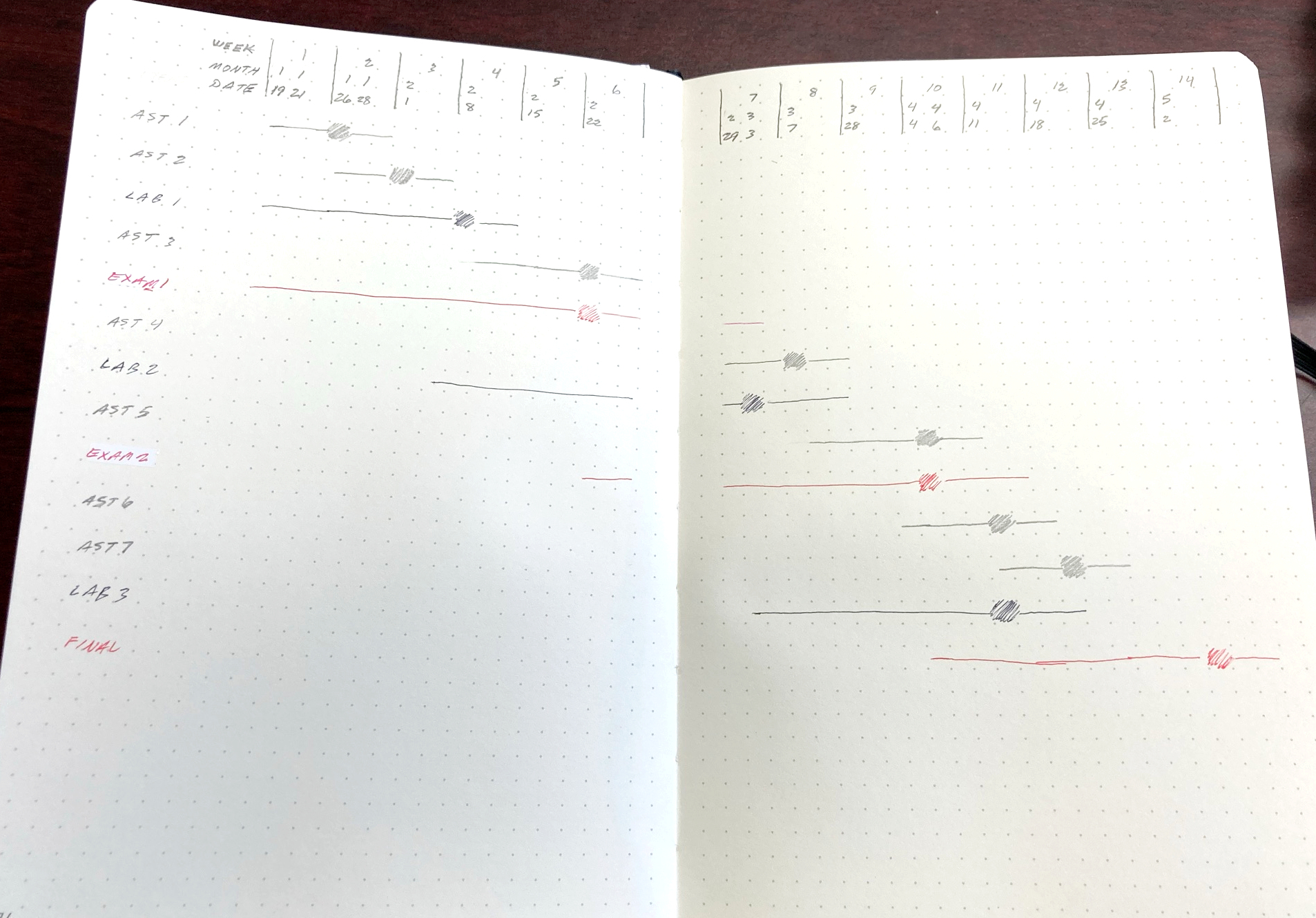
A previous post (Bullet Journal for the hard working educator) linked to a now dead page. I've updated the post so it links to the archive.org version of a page on 16 layouts for teachers. Here is an ultra-streamlined take on one layout idea from that page, a class semester for the teacher. (affiliate links included in this post)
As with the Universal Journal approach (minimal set up time) I've tried to incorporate placement, iconography, and colors to communicate as much information as possible with as little effort as possible.
The following description and included photos show a completely hypothetical semester, simply for illustration of the concepts.
Layout
The basic layout in the photo above places the semester weeks at the top of the spread. The class assignments, labs, exams, etc. are listed in the left column. So each item has its own row for any pertinent information.
The weeks are bit busy so let me unpack all that. The week number of the semester is listed on the top row. In my journal I had enough space to give each week a width of 3 columns. I don't know if each week would need to be even, I'm just channeling my inner Adrian Monk here. Perhaps a more realistic semester overview might require only 2 columns per week with some especially busy weeks requiring 4 or 5. Who knows? Adapt this set up according to your schedule. The idea is that each hard date (an assignment or due date) is recognized.
Next, the month number is listed in the middle row, with the dates in the bottom row.
The ultra-streamlined style leans toward space as a separator rather than lines but this is an early iteration of a compact layout. So I used lines to separate each week. Notice the lines are only for the weeks section at the top of the spread so I didn't need to use a straight edge. Of course you can extend the lines all the way down the page if you wish.
Notice the items in the left column are spaced out with an empty row beneath each one. I find this helps to visually separate the items and improves the look of the page. I don't like a cramped looking spread. But if you don't mind making the effort of drawing the lines (if you want them), you could compress this layout with line separators and put a lot more items on this list. Perhaps your class needs that extra room for more assignments or you could have 2 or more classes on this one spread. On the other hand, it might help keep your brain spaces separated to place each class on its own spread.
Iconography
As with the original blog post that inspired this one, I've borrowed from that writer's clever and very simple scheme to track assignments. One thing I really like and that helps me read content easier and faster is data visualization.
The lines in the main area start on the date an assignment is given to the class. The filled square designates the due date of the assignment. And the line extending past the due date is the teacher's queue for grading. Adjust this system and iconography according to your needs.
Color scheme
The pen I use is an Evolt 2+1, with 2 ink colors and a mechanical pencil all in built into one implement. I like using different colors when it helps communicate information and this teacher's semester layout is definitely one of those instances.
The exams, quizzes, and similar events for the class are in red ink in this example. The labs are in black ink. All other assignments are in pencil. Of course you can choose any color scheme you want. Your class may require more than 3 colors for various assignments or maybe just one will work for you. Hopefully this model serves as good inspiration for you to devise your own system.
If you want to try the Evolt 2+1, you'll probably need refills. Here are some more affiliate links.- Black ink (10 pack)
- Red ink (10 pack)
- 0.5 mm lead


Comments
Post a Comment